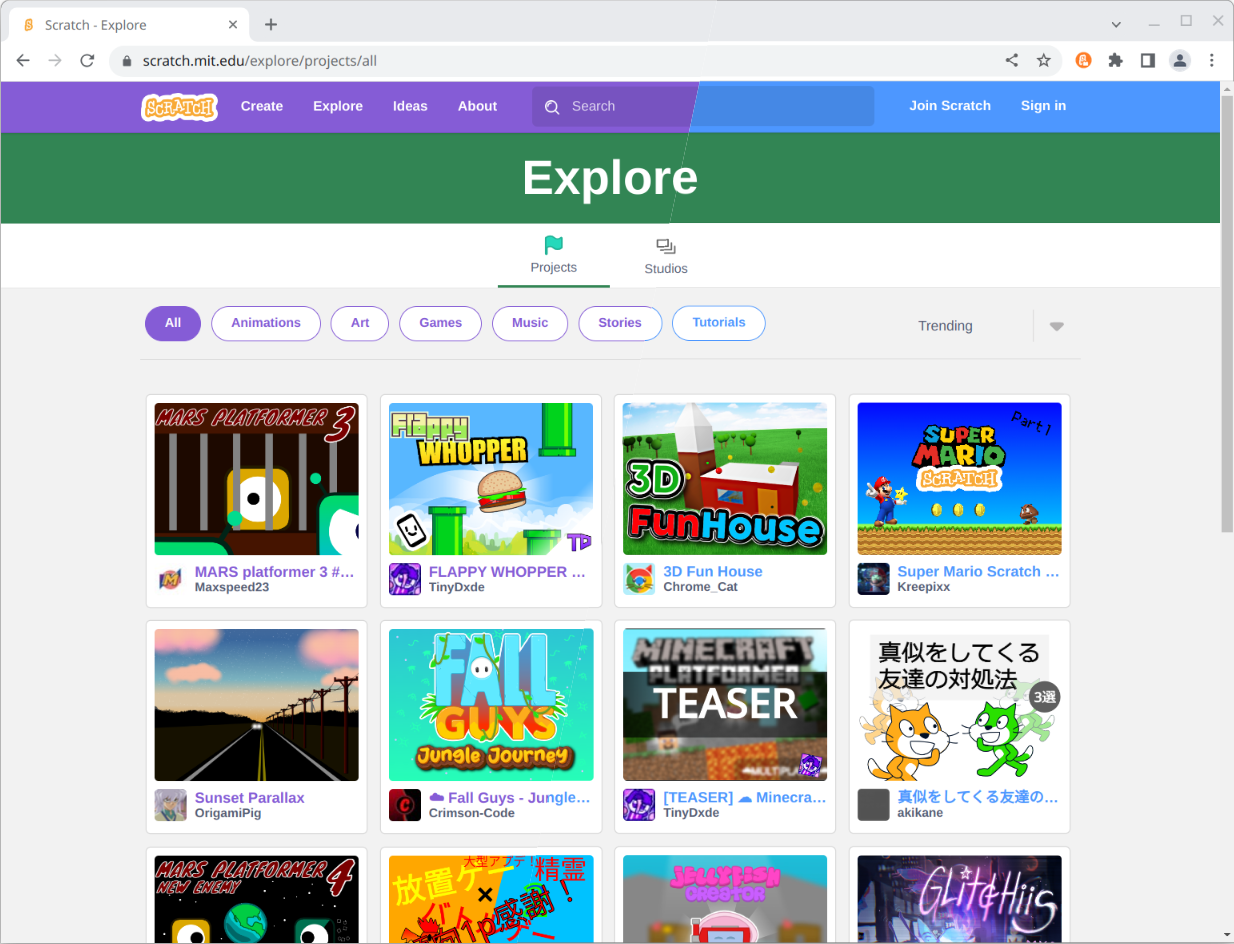
Scratch has updated the website and project editor to use purple instead of blue and introduced an option to use high contrast block colors. These change so their site can be more accessible and used by everyone, including people with disabilities. There’s more information about this change in the announcement by the Scratch Team.
We have updated Scratch Addons in response to this and suggest you try these changes, but if you still don’t like them, here’s how to switch back to blue. The links to addons will only work when Scratch Addons is installed.
- Enable the “Editor dark mode and customizable colors” addon.
- Select the “Scratch’s default colours (blue)” preset. There are also some dark mode presets in both blue and purple available if you prefer.
- Do the same for the “Website dark mode and customizable colors” addon.
Now you can make projects and browse Scratch with the blue you’re used to.

We also provide many other addons to theme the Scratch website and editor or make it more accessible including Scratch 2.0 → 3.0, Customizable block colors, Customizable block shape , Customizable block text style and Block palette category icons.
We are also planning on adding more features in the future including the option to customize the block font size and remove the text or icons from the editor menu bar.
Comments
Make sure to follow the code of conduct. You can see this comment section on GitHub Discussions, as well as editing and removing your comment.